
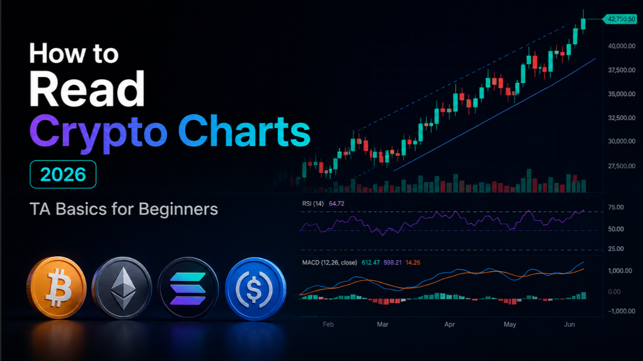
Why technical analysis matters in crypto
Technical analysis (TA) is the practice of evaluating price charts and trading data to forecast future price movements. In traditional markets it has been used for over a century. In crypto, where markets trade 24/7 and are heavily influenced by retail sentiment, TA is arguably more relevant than anywhere else — price patterns repeat because human psychology repeats.
Most professional crypto traders do not rely on TA alone, but virtually all of them use charts as a primary navigation tool. Understanding even the basics gives you a significant edge: you can identify high-probability entry and exit zones, set informed stop-losses, and avoid buying into local tops. Before looking at any individual coin like Bitcoin or Ethereum, you need to know how to read the chart in front of you.
TA does not predict the future with certainty — no tool does. What it does is give you a structured, repeatable framework for assessing risk and probability. A trader who reads charts well is not always right, but they consistently put themselves in asymmetric positions: risking a little to potentially gain a lot, and cutting losses before they become catastrophic.
Charts are the footprints of money. Every candlestick records a battle between buyers and sellers. Learning to read those footprints is the first step to trading with conviction rather than emotion.
Candlestick anatomy: understanding OHLC
The candlestick is the fundamental unit of every crypto chart. Each candle represents a fixed time period and encodes four data points: the Open, High, Low, and Close prices. This OHLC data tells you everything that happened to the price during that period at a glance.
- Open — The price at which the period started trading.
- High — The highest price reached during the period (top of the wick).
- Low — The lowest price reached during the period (bottom of the wick).
- Close — The price at which the period ended trading. This is the most important value.
The rectangular body of the candle connects the open to the close. If the close is higher than the open, the candle is bullish (typically green). If the close is lower than the open, the candle is bearish (typically red). The thin lines extending above and below the body are called wicks or shadows — they represent the price extremes tested during the period.
Candlestick shapes carry meaning. A candle with a very long lower wick and a small body near the top (called a hammer) suggests buyers rejected lower prices aggressively — a potential reversal signal in a downtrend. A candle with a very long upper wick (called a shooting star) suggests sellers rejected higher prices — a potential reversal in an uptrend. A candle with almost no wicks and a large body indicates strong conviction in the direction of the move.
Single candlestick patterns (doji, hammer, engulfing) are the vocabulary of chart reading. Two- and three-candle patterns like the bullish engulfing, morning star, and evening star form the sentences. The more context you have — the trend, the volume, the key level the pattern forms at — the more meaningful any individual pattern becomes.
Timeframes: 1H, 4H, 1D, and 1W charts explained
Every chart is a view of price action filtered through a specific timeframe. Each candle on a 1-hour (1H) chart represents 60 minutes of trading. On the 1-day (1D) chart, each candle represents 24 hours. On the 1-week (1W) chart, each candle represents a full seven days. The chart does not change — only the zoom level does.
- 1H (one-hour) chart — Used by active traders and scalpers. Shows intraday structure, entry timing for swing trades, and short-term momentum. Very noisy; minor levels appear and disappear quickly. Useful for precision entries after identifying the trade idea on a higher timeframe.
- 4H (four-hour) chart — The most commonly referenced timeframe in crypto swing trading. Balances enough detail to identify patterns with enough smoothness to filter out 1H noise. Most traders set alerts and manage trades on the 4H.
- 1D (one-day) chart — The primary timeframe for identifying major trends, support and resistance zones, and trading the overall market cycle. Most significant technical signals originate here. Swing traders and position traders use it as their main reference.
- 1W (one-week) chart — The macro view. On-chain analysts and long-term investors use the weekly chart to understand multi-month trends, identify major accumulation zones, and filter out the noise of daily price swings. Weekly support and resistance are the most durable levels in any market.
The golden rule of timeframe analysis is top-down: always start on the highest relevant timeframe to understand the macro context, then step down to lower timeframes for entry and exit precision. A buy signal on the 1H chart has very different implications depending on whether the 1D chart is in a strong uptrend or a confirmed downtrend.
For swing trading Bitcoin, the practical workflow is: check the 1W chart for macro trend direction, check the 1D chart for the key level you are near, use the 4H chart for pattern confirmation, and use the 1H chart for precise entry timing. See Bitcoin price forecast and Ethereum price forecast for current multi-timeframe analysis from our analysts.
Support and resistance: the backbone of chart reading
Support is a price level where buying pressure has historically been strong enough to halt or reverse a decline. Resistance is a price level where selling pressure has historically been strong enough to halt or reverse a rally. These levels are the foundation of all chart analysis — everything else (trends, patterns, indicators) is built on top of them.
Support and resistance levels form in several ways. A previous swing high (the highest point reached before a pullback) becomes resistance once price reverses from it. A previous swing low becomes support. Round numbers ($50,000, $100,000 for Bitcoin) attract orders because traders anchor to them psychologically. High-volume nodes — price levels where the most trading volume has historically changed hands — act as the strongest magnets in the market.
A key concept is role reversal: once a support level is broken convincingly, it often flips to become resistance on any subsequent retest. This is because traders who bought at the support level are now underwater and will sell to break even when price returns — creating a supply wall. Conversely, a broken resistance level becomes support on retests as buyers who missed the breakout enter on the pullback.
- Drawing support/resistance correctly: Connect at least two significant price touches on the same timeframe. Three or more touches make the level stronger.
- Zones, not lines: Support and resistance are ranges, not exact prices. Draw them as boxes to account for wicks and minor variations.
- Higher timeframe levels dominate: A weekly support level is far more significant than a 1H support. When multiple timeframes align on the same zone, the confluence is highly significant.
- Volume confirms levels: A support or resistance level accompanied by high volume at that price (visible on a volume profile tool) is more reliable than one with light volume.
Trend lines and channels: mapping the dominant direction
A trend line is a straight line drawn across a series of price highs or lows that defines the dominant direction of price movement. An uptrend line connects a series of higher lows — each time price dips and finds buyers at a progressively higher level, you draw the line across those lows. A downtrend line connects a series of lower highs — each time price rallies and finds sellers at a progressively lower level, you draw the line across those highs.
Trend lines serve two purposes: they define the trend and they act as dynamic support or resistance. In an uptrend, the trend line beneath price is support — traders expect buyers to step in every time price pulls back to the trend line. A clean bounce off the trend line, especially on lower volume, is a high-confidence long entry. A decisive break of the trend line on high volume is a significant warning sign that the trend may be ending.
A channel is formed when two parallel trend lines contain price action — one along the lows (support) and one along the highs (resistance). In a rising channel, the strategy is to buy pullbacks to the lower channel line and take profit near the upper channel line. In a descending channel (a bear flag), traders watch for a breakout above the upper trend line as a potential reversal signal.
Practical tip: trend lines are most reliable when drawn across wick tips on the 4H or 1D chart. On lower timeframes they can be too subjective. Use TradingView (covered in the final section) to experiment with drawing trend lines on Bitcoin across major market cycles — the 2020–2021 bull market channel and the 2022 bear market descending channel are textbook examples.
Moving averages: MA50, MA200, and EMA explained
A moving average smooths price data by calculating the average closing price over a specified number of periods. Instead of looking at the jagged up-and-down of raw price, a moving average shows you the underlying trend direction at a glance. It is one of the most widely used indicators in all of trading.
The two most important types are the Simple Moving Average (SMA) and the Exponential Moving Average (EMA). The SMA gives equal weight to every period in the calculation window. The EMA gives more weight to recent prices, making it react faster to new price action. Most traders use EMAs for shorter-term analysis (9 EMA, 21 EMA) and SMAs for longer-term trend identification (50 SMA, 200 SMA).
- MA50 (50-period SMA) — The medium-term trend indicator. Price consistently trading above MA50 on the 1D chart is a bullish sign. The MA50 often acts as the first line of support in a healthy uptrend. A breakdown below the MA50 that holds is a warning; one that fails to recover increases the probability of a deeper correction.
- MA200 (200-period SMA) — The single most-watched moving average across all markets. The 200-day MA separates bull market territory (price above MA200) from bear market territory (price below MA200). In Bitcoin's history, every multi-month bear market has traded below the daily 200 MA. Reclaiming the 200 MA is one of the most bullish signals a macro analyst can identify.
- EMA (Exponential Moving Average) — EMAs are preferred by active traders because they respond faster to price changes. The 21 EMA on the 4H chart is a widely used dynamic support level in trending markets. A cluster of short-term EMAs (9, 21, 55) converging in the same zone is a strong area of interest for entries.
The golden cross — when the 50 MA crosses above the 200 MA — is a classic long-term bullish signal. The death cross — when the 50 MA crosses below the 200 MA — is the inverse bearish signal. Both lagging indicators are more useful for confirming a trend than predicting one, but institutional algorithms are programmed to respond to these crossovers, making them self-fulfilling to a degree.
RSI explained: reading overbought and oversold conditions
The Relative Strength Index (RSI) is a momentum oscillator that measures the speed and magnitude of recent price changes on a scale from 0 to 100. Developed by J. Welles Wilder in 1978, it remains one of the most widely used technical indicators in crypto and traditional markets. The default calculation uses 14 periods.
The standard interpretation: an RSI reading above 70 indicates the asset is overbought — price has risen sharply and a pullback or consolidation is more likely. An RSI reading below 30 indicates the asset is oversold — price has fallen sharply and a bounce or reversal is more likely. In strong bull markets, RSI can stay above 70 for extended periods. In strong bear markets, it can stay below 30. Context matters.
- RSI divergence (most powerful signal) — When price makes a new high but RSI makes a lower high, that is bearish divergence — momentum is weakening even though price looks strong. This is one of the most reliable reversal warnings in TA. Conversely, when price makes a new low but RSI makes a higher low (bullish divergence), selling pressure is losing momentum despite the apparent weakness in price.
- RSI midline (50) — Crossing above 50 confirms bullish momentum; crossing below 50 confirms bearish momentum. In a strong uptrend, the RSI tends to find support at or above 50 on pullbacks.
- Timeframe relevance — RSI divergence on the 1D or 1W chart carries far more weight than on the 1H chart. A daily RSI divergence at a major resistance level after a prolonged rally is a high-conviction signal to reduce exposure.
Practical application: do not use RSI as a standalone buy or sell trigger. A 1D RSI reading of 28 in a confirmed downtrend is not automatically a buy — it may simply indicate the trend is very strong. Combine RSI readings with support/resistance levels and trend direction for actionable signals.
MACD basics: trend and momentum in one indicator
The Moving Average Convergence Divergence (MACD) is a trend-following momentum indicator that shows the relationship between two exponential moving averages of price. The standard settings use the 12 EMA and 26 EMA to calculate the MACD line, and a 9 EMA of the MACD line as the signal line. The histogram shows the difference between the MACD line and the signal line.
MACD consists of three components displayed together below the price chart: the MACD line (12 EMA minus 26 EMA), the signal line (9 EMA of the MACD line), and the histogram (MACD minus signal). When the MACD line crosses above the signal line, it is a bullish crossover — a potential buy signal. When the MACD line crosses below the signal line, it is a bearish crossover — a potential sell signal.
- Bullish/bearish crossover — The most basic MACD signal. Most reliable when the crossover occurs after a period of extended directional movement and happens near the zero line.
- Zero line cross — When the MACD line crosses above zero, it signals that short-term momentum is now bullish relative to medium-term momentum. A cross below zero signals the inverse.
- MACD divergence — Like RSI divergence, MACD divergence (price makes new high/low while MACD does not) is a powerful warning of trend exhaustion. Daily MACD bearish divergence has preceded several major Bitcoin tops.
- Histogram shrinkage — When the histogram bars are getting shorter (converging toward zero) during a trend, it indicates the trend is losing momentum — a potential early warning before an actual crossover occurs.
MACD is a lagging indicator — it is derived from moving averages and therefore always reflects past price action. It is excellent for confirming trend direction and detecting shifts in momentum, less useful for timing precise entries. On the 4H and 1D charts, MACD crossovers at key support or resistance levels are high-quality signals when combined with price action confirmation.
Volume confirmation: why price without volume is incomplete
Volume measures the total number of coins or contracts traded during a given period. It is the fuel of price movements. A price rally on high volume is a strong, confirmed move — many participants are buying aggressively. A rally on declining volume is suspect — fewer participants are driving the price higher, and the move may not be sustainable.
The core principle of volume analysis: volume should confirm price. In an uptrend, volume should be higher on up-candles than down-candles. In a downtrend, volume should be higher on down-candles. When this relationship breaks down — when a rally is accompanied by consistently declining volume — it is a warning that the move lacks conviction.
- Breakout confirmation — A price breakout above a resistance level on 2–3x average volume is a high-confidence breakout. The same price move on below-average volume is a potential fake-out — wait for a retest of the broken level before entering.
- Volume climax — An extremely high-volume candle (3–5x normal) at the end of a long trend often marks exhaustion. Sellers (or buyers) are finally capitulating, absorbing all remaining supply (or demand). This is sometimes the final move before a trend reversal.
- Volume Profile — Available on TradingView's premium tiers, volume profile shows the historical distribution of volume across price levels (not time). High-volume nodes (HVN) act as strong support or resistance. Low-volume nodes (LVN) are areas where price moves quickly, as there is little historical transactional memory.
- On-Balance Volume (OBV) — A cumulative indicator that adds volume on up-days and subtracts volume on down-days. OBV diverging from price (OBV making new highs while price is flat, for example) suggests institutional accumulation is occurring quietly — a classic early signal before a breakout.
Common chart patterns: head & shoulders, triangle, and flag
Chart patterns are recurring formations in price action that have historically preceded specific types of price movements. They work because they reflect repeating crowd psychology — fear, greed, indecision, and resolve playing out in the same sequences over and over. Here are the three most important patterns for beginners to master.
Head and shoulders (reversal pattern)
The head and shoulders is the most reliable reversal pattern in technical analysis. It forms at the top of an uptrend and consists of three peaks: a left shoulder (first rally and pullback), a head (the highest peak, followed by a pullback), and a right shoulder (a lower rally that fails to reach the head, followed by another pullback). The neckline connects the two pullback lows. A confirmed breakdown below the neckline on volume is a strong sell signal. The measured move target is the height from the head to the neckline, projected downward from the neckline break.
The inverse head and shoulders is the mirror image: it forms at the bottom of a downtrend and signals a potential reversal to the upside. A breakout above the neckline on strong volume confirms the pattern.
Triangle patterns (continuation and reversal)
Triangles form when price makes lower highs and higher lows simultaneously, creating converging trend lines. A symmetrical triangle reflects indecision between buyers and sellers — a breakout in either direction is possible, though the breakout more often continues the prior trend. An ascending triangle (flat resistance, rising lows) is a bullish continuation pattern. A descending triangle (flat support, falling highs) is a bearish continuation pattern.
The measured move target for a triangle: measure the height at the widest part of the triangle and project it from the breakout point in the breakout direction. Volume should surge on the breakout candle.
Bull flag (continuation pattern)
A bull flag forms after a sharp, nearly vertical rally (the flagpole) followed by a tight, relatively low-volume consolidation that drifts slightly lower (the flag). It represents a brief pause as short-term traders take profits before the trend continues. The breakout above the upper flag boundary, ideally on expanding volume, signals continuation. The measured target is the length of the flagpole added to the breakout point. Bitcoin has printed textbook bull flags at multiple stages of its bull cycles.
TA tools: TradingView, GMX charts, and Coinglass
Having the right tools makes the difference between amateur chart reading and professional analysis. These three platforms cover the essential needs of any crypto trader at the beginner-to-intermediate level.
TradingView
TradingView is the industry-standard charting platform for crypto and traditional markets alike. It is available at tradingview.com with a free tier that covers the vast majority of beginner needs. Every major crypto exchange feeds live price data into TradingView — you can chart BTC/USD from Binance, Coinbase, Kraken, and Bybit simultaneously to identify price discrepancies.
- Free tier: 3 indicators simultaneously on 1D/4H charts, access to most major pairs
- Pro tier ($14.95/month): 5+ indicators, volume profile, more alerts, faster data refresh
- Drawing tools: trend lines, channels, Fibonacci retracement, horizontal rays, pitchfork
- Community scripts: thousands of free custom indicators shared by the TradingView community
- Pine Script: TradingView's native scripting language — build your own indicators and strategies
- Alerts: set price, indicator, or pattern-based alerts via email, SMS, or webhook
Start by adding the following indicators to your default chart layout: 50 SMA (daily), 200 SMA (daily), RSI (14-period, on a separate pane), MACD (12/26/9, on a separate pane), and Volume bars. This five-indicator setup covers trend direction, momentum, and volume confirmation — everything covered in this article.
GMX charts (on-chain derivatives)
GMX is a leading decentralized perpetual futures exchange on Arbitrum and Avalanche. Its built-in charting interface, while less feature-rich than TradingView, is essential for traders using GMX for leveraged positions — the charts are directly tied to the execution environment, so there is no price feed discrepancy. You can access GMX charts through the GMX interface when trading BTC, ETH, and other major pairs. For current GMX token data, see the Ethereum market page for context on the broader DeFi ecosystem.
Coinglass
Coinglass (coinglass.com) is the most comprehensive crypto derivatives data platform available. It aggregates open interest, funding rates, liquidation levels, and long/short ratios across all major centralized exchanges. These on-chain and derivatives metrics add a powerful layer to pure price chart analysis.
- Liquidation heatmap — Shows the price levels where large amounts of leveraged positions would be liquidated. Price often gravitates toward high-liquidation zones as market makers hunt stop-losses. This is one of the most actionable features in Coinglass.
- Open interest — Rising open interest with rising price confirms a healthy uptrend. Rising price with falling open interest suggests the move is driven by short covering rather than fresh longs — less sustainable.
- Funding rate — In perpetual futures, funding rates indicate whether longs or shorts are paying a premium to hold positions. Extreme positive funding (longs paying a very high rate) signals overleveraged optimism — a contrarian warning. Extreme negative funding signals excessive fear.
- Long/short ratio — Retail sentiment indicator. Extreme readings (90%+ longs or 90%+ shorts) have historically preceded short-term reversals as the crowded side gets liquidated.
The combination of TradingView for chart patterns and indicators, and Coinglass for derivatives data and sentiment, gives you a complete analytical toolkit. To put everything into practice with structured guidance, read the crypto beginner roadmap which maps a learning path from first wallet to first trade.
Technical analysis is a skill — it improves dramatically with practice. Begin with the basics: learn to identify candlestick patterns, draw support and resistance zones correctly, and understand what the MA50, MA200, RSI, and MACD are telling you. Add volume confirmation to every signal you evaluate. Then start applying chart patterns: head and shoulders, triangles, and flags appear on every chart, every week. Use TradingView to build your chart layouts and Coinglass to monitor market structure and derivatives sentiment.
The goal at the beginner stage is not to find perfect entries — it is to develop the habit of reading charts before making any trade decision. Whether you are assessing Bitcoin for a swing trade or evaluating Ethereum for a long-term position, the same framework applies. TA does not guarantee profits, but it does ensure you are never trading blind.